Style Guide
Structure Classes
Defined and flexible core structure we can use on all or most pages.
HTML Heading Tags + Style classes
Sample text helps you understand how real text may look.
Sample text helps you understand how real text may look.
Sample text helps you understand how real text may look.
Sample text helps you understand how real text may look on your website.
Sample text is being used as a placeholder. Sample text helps you understand how real text may look.
Sample text helps you understand how real text may look on your website. Sample text is being used as a placeholder for real text that is normally present.
Sample text helps you understand how real text may look on your website. Sample text is being used as a placeholder for real text that is normally present.
Sample text is being used as a placeholder. Sample text helps you understand how real text may look. Sample text is being used as a placeholder for real text that is normally present.
Sample text is being used as a placeholder. Sample text helps you understand how real text may look. Sample text is being used as a placeholder for real text that is normally present. Sample text helps you understand how real text may look.
Sample text is being used as a placeholder for real text that is normally present. Sample text helps you understand how real text may look. Sample text is being used as a placeholder for real text that is normally present. Sample text helps you understand how real text may look.
Other HTML Tags
HTML tags define default text styles.
Sample text is being used as a placeholder for real text that is normally present. Sample text helps you understand how real text may look on your website. Sample text is being used as a placeholder for real text.
Sample text is being used as a placeholder for real text that is normally present. Sample text helps you understand how real text may look on your website.
- Sample text is being used as a placeholder for real text that is normally present.
- Sample text is being used as a placeholder for real text that is normally present.
- Sample text is being used as a placeholder for real text that is normally present.
- Sample text is being used as a placeholder for real text that is normally present.
- Sample text is being used as a placeholder for real text that is normally present.
- Sample text is being used as a placeholder for real text that is normally present.
Text Classes
Text classes when typography style doesn't match the default HTML tag.
Text Sizes
Sample text is being used as a placeholder for real text that is normally present.
Sample text is being used as a placeholder for real text that is normally present on your website.
Sample text is being used as a placeholder for real text that is normally present. Sample text helps you understand how real text may look on your website.
Sample text is being used as a placeholder for real text that is normally present on your website. Sample text helps you understand how real text may look on your website.
Text Styles
text-style-strikethrough
text-style-muted
text-style-allcaps
text-style-link
Text Weights
Text Alignments
Buttons
Button combo class system.
Colors
Manage recurring text and background colors.
Text Colors
Background Colors
Max widths
Use the max-width CSS property to contain inner content to a maximum width.
Spacers
Utility spacing system - [spacer-size].
Useful utility systems
Utility classes we like to use in most of our projects to build faster.
Webflow elements
Native Webflow elements with Client-First classes applied.
Example of a form component using Folders
Heading 1
Heading 2
Heading 3
Heading 4
Heading 5
Heading 6
Sample text with a link is being used as a placeholder for real text that is normally present. Sample text helps you understand how real text may look on your website. Sample text is being used as a placeholder for real text. Sample text is being used as a placeholder for real text. Sample text is being used as a placeholder for real text.
- Sample text is being used as a placeholder for real text that is normally present.
- Sample text is being used as a placeholder for real text that is normally present.
- Sample text is being used as a placeholder for real text that is normally present.
- Sample text is being used as a placeholder for real text that is normally present.
- Sample text is being used as a placeholder for real text that is normally present.
- Sample text is being used as a placeholder for real text that is normally present.
Sample text is being used as a placeholder for real text that is normally present. Sample text helps you understand how real text may look on your website. Sample text is being used as a placeholder for real text that is normally present.


Columns
The building’s large Stalinist-era columns express the architectural language of the period—solid proportions, classical references, and an emphasis on authority and permanence. Their presence links the structure to the broader visual narrative of socialist realism.
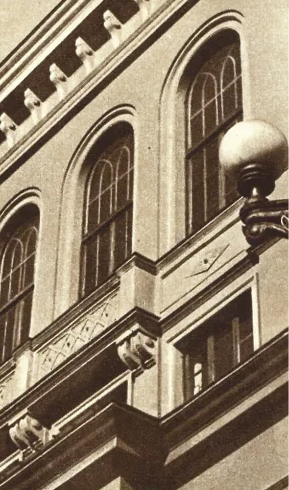
Arches
The arched windows reference traditional Georgian architectural motifs, grounding the building in local identity and early 20th-century expression. They create a rhythm that connects the structure to Tbilisi’s architectural heritage.
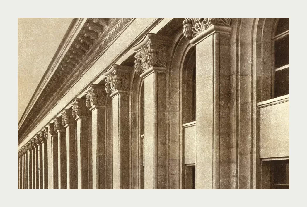
Columns
The building’s large Stalinist-era columns express the architectural language of the period—solid proportions, classical references, and an emphasis on authority and permanence. Their presence links the structure to the broader visual narrative of socialist realism.
Column Capitals
Corinthian-inspired capitals introduce a layer of ornamentation rooted in classical architecture. These details reflect a tradition of refinement and aesthetic continuity, bridging Soviet monumentalism with the enduring influence of ancient forms.
Arches
The arched windows reference traditional Georgian architectural motifs, grounding the building in local identity and early 20th-century expression. They create a rhythm that connects the structure to Tbilisi’s architectural heritage.
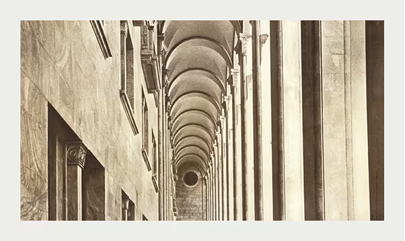
Bofill Arches
The arches integrated into the renewed interpretation draw inspiration from Ricardo Bofill’s approach—bridging industrial character with classical geometry. They symbolize continuity, resilience, and an architectural dialogue between past and present.
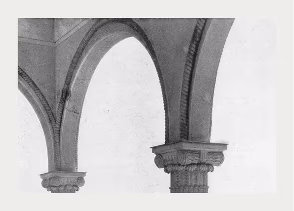
Column Capitals
Corinthian-inspired capitals introduce a layer of ornamentation rooted in classical architecture. These details reflect a tradition of refinement and aesthetic continuity, bridging Soviet monumentalism with the enduring influence of ancient forms.
Bofill Arches
The arches integrated into the renewed interpretation draw inspiration from Ricardo Bofill’s approach—bridging industrial character with classical geometry. They symbolize continuity, resilience, and an architectural dialogue between past and present.